Every developer eventually hits the same realization: the color scheme staring back at you every day isn’t a minor detail — it’s part of your working environment, on par with your keyboard, your monitor, and your chair. Get it wrong, and you feel it by the end of a long shift. Get it right, and hours pass without your eyes ever putting up a fight.
That’s the exact reason Gruvbox has built such a dedicated following over the years. It isn’t a trendy theme that showed up overnight. it’s a color scheme that’s been refined, forked, and battle-tested across thousands of real coding sessions, terminal windows, and late-night debugging marathons.
What Is the Gruvbox Theme?
Gruvbox is a retro groove color scheme originally built for Vim by developer Pavel Pertsev. The design brief behind it was straightforward but demanding: colors needed to be easily distinguishable from one another, contrast had to be strong enough to support fast reading, and none of it could feel harsh after hour four of a coding session.
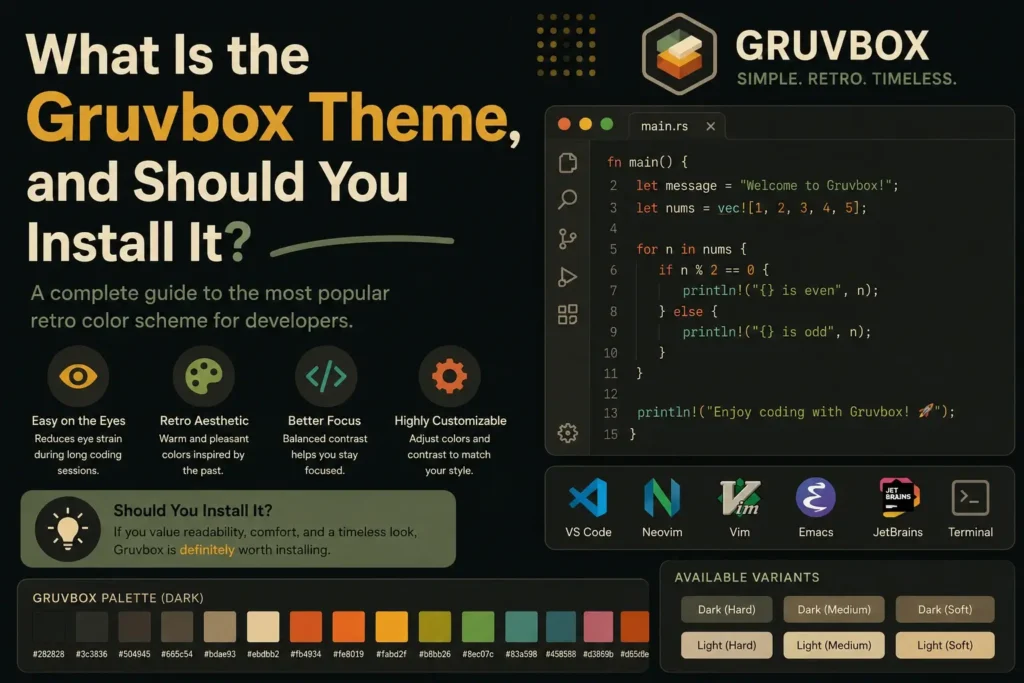
Instead of following the cool-blue, high-contrast direction so many modern themes take, Gruvbox goes warm — mustard yellows, burnt oranges, olive greens, and soft browns, laid over a muted dark or light background. It has a distinctly vintage character, which is exactly where the “retro groove” name comes from.
What started as a Vim-only project has since expanded into one of the most widely ported color schemes in the developer world, now available across code editors, terminal emulators, note-taking apps, and even custom desktop interfaces.
The Design Philosophy Behind Gruvbox
What separates Gruvbox from a simple “dark theme” is the intentionality behind its color choices. It wasn’t built by picking colors that looked nice in a screenshot. it was built around real, sustained readability.
A few principles guide the palette:
- Desaturation over saturation. Bright, neon colors might look striking for a screenshot, but they fatigue the eyes over time. Gruvbox intentionally mutes its palette to stay comfortable for hours, not minutes.
- Warm undertones instead of cold ones. Cooler themes can feel clinical or sterile. Gruvbox’s warmth gives your workspace a more human, lived-in feel.
- Balanced contrast, not maximum contrast. The goal isn’t to make text “pop” as aggressively as possible — it’s to make sure every element is distinguishable without competing for attention.
This is also why Gruvbox includes contrast variants. hard, medium, and soft. rather than forcing one fixed intensity. A developer working in a sunlit home office has very different lighting needs than someone coding at 1 a.m. with the lights off, and Gruvbox is built to accommodate both realities.
What Users Actually Notice After Switching
Beyond the technical design, what keeps people using Gruvbox long-term usually comes down to a handful of recurring experiences:
- Less end-of-day eye fatigue. Many long-time users report that switching from a stark black-and-white theme to Gruvbox noticeably reduces the “tired eyes” feeling after extended screen time.
- Faster visual scanning. Because syntax elements are color-coded with enough separation but not jarring contrast, it becomes easier to scan through unfamiliar code and quickly locate functions, strings, or comments.
- A workspace that feels personal. The retro warmth gives a sense of character that a lot of default, corporate-feeling themes lack — something users often mention when explaining why they stuck with it.
- Consistency across tools. Once someone commits to Gruvbox in their editor, they often extend it to their terminal and note-taking apps too, creating a unified visual environment across their entire workflow.
Of course, individual experience always varies. some people simply respond better to cooler tones, and that’s a legitimate preference, not a flaw in the theme.
Key Features That Make Gruvbox Stand Out
- A warm, retro-inspired 16-color palette that’s visually distinct from typical cool-toned editor themes.
- Full dark and light mode support, so it adapts to different lighting conditions and work schedules.
- Adjustable contrast levels (hard, medium, soft) for fine-tuning based on your screen and environment.
- Extensive cross-platform support, including Vim, Neovim, Sublime Text, Typora, and terminal emulators like iTerm2, Alacritty, Warp, and Ghostty.
- An active, long-running open-source community that continues to maintain ports, forks, and improvements years after the original release.
Should You Install Gruvbox? A Practical Framework
Rather than a blanket recommendation, the smarter approach is to weigh Gruvbox against your actual habits and working style.
Signs Gruvbox Is a Strong Fit
- You spend multiple hours a day in a code editor or terminal, and eye comfort genuinely affects your productivity.
- You’re drawn to warm, earthy aesthetics rather than cold, sterile ones.
- You want granular control over contrast rather than a one-size-fits-all theme.
- You use several different tools daily and want a consistent visual identity across all of them.
- You value a theme with a large, active community, meaning better long-term support and more integrations.
Signs You Might Look Elsewhere
- You gravitate toward cool tones like blues and teals, in that case, a theme like Nord may suit your eyes better.
- You prefer a strict, minimalist black-and-white aesthetic without warm accents.
- Your current theme already works well for you, and switching would be a purely cosmetic change with no functional upside.
There’s no universally “correct” answer here. The right theme is the one that keeps your eyes comfortable and your workflow efficient — not the one with the most hype behind it.
How to Install Gruvbox: Step-by-Step
While the exact process differs slightly by application, the overall workflow is consistent:
- Locate the correct package for your specific tool, most Gruvbox ports are hosted on GitHub or distributed through a package manager (Package Control for Sublime Text, a plugin manager for Neovim, and so on).
- Install it through your app’s package system, following the standard installation method for that tool.
- Configure your preferences. Many ports let you adjust contrast level, italics, bold text, transparency, and more before activating the theme.
- Set Gruvbox as your active theme by updating your configuration file to reference it.
- Restart the application to ensure all visual changes take full effect.
As an example, in Neovim using the popular gruvbox.nvim port, you’d typically run a setup function first — configuring things like contrast level and italic styling, before activating the colorscheme itself. This order matters: setup should always happen before activation for your custom preferences to apply correctly.
Exploring the Gruvbox Family of Variants
Gruvbox has evolved well beyond a single fixed theme. Depending on your priorities, one of these variants might serve you even better than the original:
- Gruvbox Materia: a softer-contrast adaptation built specifically to reduce eye fatigue even further, while preserving the same warm identity.
- gruvbox.nvim: a modern, actively maintained Lua-based port for Neovim, offering deep customization, treesitter support, and semantic highlighting.
- Gruvbox for Typora: brings the same retro warmth into Markdown writing and note-taking environments.
- Gruvbox for terminals: dedicated builds for iTerm2, Alacritty, Warp, Ghostty, and other popular terminal emulators.
Testing a couple of these variants side by side is often the fastest way to land on the exact contrast level and tone that fits your eyes and your setup.
Common Mistakes to Avoid When Switching
- Skipping the contrast setting. Many new users install Gruvbox with default settings and assume that’s the “full experience.” Taking a few minutes to try hard, medium, and soft contrast can make a noticeable difference in comfort.
- Not restarting the application. Some tools require a full restart (not just a reload) for the theme to apply completely.
- Ignoring companion plugins. Certain editors need supporting plugins (like syntax highlighters or status line themes) to display Gruvbox at its best, without them, you may only see a partial version of the intended look.
Frequently Asked Questions
1. What exactly is the Gruvbox theme?
Gruvbox is a retro-inspired color scheme originally built for Vim, known for its warm, earthy palette and comfortable contrast levels designed for long coding or writing sessions.
2. Is Gruvbox better for your eyes than a standard dark theme?
Many users report less eye fatigue with Gruvbox compared to stark black-and-white themes, thanks to its muted, desaturated colors and balanced contrast. Results can vary based on personal preference and screen setup.
3. Does Gruvbox work in tools other than Vim?
Yes. Gruvbox has been ported to a wide range of applications, including Neovim, Sublime Text, Typora, and terminal emulators like iTerm2, Alacritty, Warp, and Ghostty.
4. What’s the difference between hard, medium, and soft contrast in Gruvbox?
These settings control how intense the contrast between background and text appears. Hard contrast suits brighter environments, while soft contrast is gentler for low-light or nighttime use.
5. Is Gruvbox available in light mode?
Yes. Gruvbox offers both dark and light variants, so you can switch depending on the time of day or your lighting conditions.
6. How do I know if Gruvbox is right for me?
If you spend long hours coding or writing and prefer warm, earthy tones over cool blues, Gruvbox is likely a strong fit. If you prefer minimalist black-and-white setups or cooler palettes, it may not suit your taste as well.
7. Is Gruvbox free to install?
Yes. Gruvbox and its variants are open-source and completely free to download and use.
8. What’s the easiest way to install Gruvbox?
Most tools let you install Gruvbox through their built-in package manager (like Package Control for Sublime Text or a plugin manager for Neovim), followed by activating it in your configuration file and restarting the app.
9. What’s the difference between Gruvbox and Gruvbox Material?
Gruvbox Material is a softer-contrast variation of the original theme, designed to reduce eye strain even further while keeping the same warm color identity.
10. Can I customize Gruvbox’s colors?
es. Many Gruvbox ports, including gruvbox.nvim, allow you to override specific colors, adjust contrast, and fine-tune styling like italics or bold text to match your preferences.
Conclusion
If you’re someone who spends meaningful time in a code editor or terminal and values comfort, customization, and a distinctive aesthetic, Gruvbox is genuinely worth trying. It’s free, actively maintained, backed by a substantial open-source community, and flexible enough to adapt to your exact environment and lighting conditions.
That said, no single color scheme is objectively “the best” for everyone. If your eyes respond better to cooler tones or a stripped-down monochrome look, there’s no downside to sticking with what already works. The most reliable way to know for sure is simple: install it, live with it for a few days, and pay attention to how your eyes, and your focus, actually respond.