A color scheme is one of the few tools you interact with continuously, for hours at a time, without ever consciously thinking about it, until it’s wrong. Installing Gruvbox is the easy part. Configuring it so it genuinely fits your monitor, your lighting, your editor, and your personal reading comfort is where most guides stop short.
This is a complete, professional walkthrough covering installation across the most common tools, every meaningful customization option, accessibility considerations, maintenance best practices, and the troubleshooting steps that actually resolve real setup problems, not just generic advice to “restart the app.”
Understanding What You’re Installing
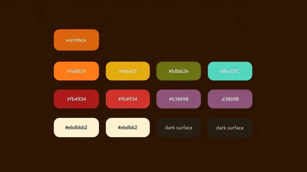
Before making any changes, it helps to understand what Gruvbox actually consists of under the hood. It isn’t a single file or a single “look” — it’s a defined 16-color palette, paired with a set of highlight-group mappings that tell your application which color to apply to which type of text (keywords, strings, comments, backgrounds, and so on).
This structure is exactly why Gruvbox has been so reliably ported across dozens of tools: any application capable of mapping colors to syntax elements can adopt the same palette and produce a consistent visual identity.
What You’ll Need Before Starting
- A package or plugin manager appropriate to your application (a Neovim plugin manager, Package Control for Sublime Text, or your terminal’s built-in theme importer).
- Comfortable access to your configuration file, since most meaningful customization happens through settings rather than menus.
- True-color (24-bit) terminal support, if you’re applying Gruvbox to a terminal emulator — older or misconfigured terminals can render the palette incorrectly.
- A short testing window. Comfort differences between contrast levels are rarely obvious in the first thirty seconds; give each setting a real working session before judging it.
Step 1: Installing Gruvbox in Neovim
Neovim is one of the most common environments for running Gruvbox, largely due to the actively maintained gruvbox.nvim port, which offers Lua-based configuration, treesitter support, and semantic highlighting.
- Install the plugin through your plugin manager of choice (lazy.nvim, packer.nvim, or similar).
- Call the setup function first, configuring your preferences for contrast, italics, bold text, and terminal color support.
- Activate the colorscheme as a separate step, after setup.
- Restart or reload Neovim to confirm the configuration has applied correctly.
A representative configuration:
require("gruvbox").setup({
  terminal_colors = true,
  undercurl = true,
  underline = true,
  bold = true,
  italic = {
    strings = true,
    comments = true,
  },
  contrast = "hard", -- options: "hard", "soft", or "" for default
  transparent_mode = false,
})
vim.cmd("colorscheme gruvbox")
Critical ordering note: the setup function must run before the colorscheme command. Reversing this order is the single most common reason custom settings silently fail to apply.
Step 2: Installing Gruvbox in Sublime Text
Sublime Text supports Gruvbox through Package Control, its native package manager.
- Open the Command Palette (
Ctrl+Shift+Pon Windows/Linux,⌘⇧Pon Mac). - Select Package Control: Install Package.
- Search for Gruvbox and install it.
- Update your Preferences > Settings – User file to specify your preferred theme and contrast variant:
{
  "theme": "gruvbox.sublime-theme",
  "color_scheme": "Packages/gruvbox/gruvbox (Dark) (Hard).sublime-color-scheme"
}
- Restart Sublime Text to fully apply the new theme and color scheme together.
Sublime’s implementation includes dark and light variants, each available in hard, medium, and soft contrast, matching the flexibility found in other ports.
Step 3: Installing Gruvbox in a Terminal Emulator
Extending Gruvbox into your terminal creates a unified visual environment across your entire development workflow. Well-supported terminals include:
- iTerm2
- Alacritty
- Warp
- Ghostty
The general workflow involves downloading the color configuration file built for your specific terminal, then importing or referencing it through that terminal’s preferences or configuration file. Once applied, command output, prompts, and CLI tools like git diff, grep, and ls will follow the same warm, low-contrast palette as your editor.
Important: confirm your terminal is configured for true-color (24-bit) support before installing. Terminals limited to 256-color mode will approximate the palette rather than render it accurately, which is one of the most common sources of “this doesn’t look right” complaints.
Step 4: Installing Gruvbox in Typora
Writers and note-takers can bring the same palette into Markdown editing through the Gruvbox theme for Typora.
- Download the Gruvbox theme file for Typora.
- Place it inside Typora’s themes directory.
- Select it from the Themes menu within the application.
This provides full syntax highlighting for embedded code blocks and a consistent, comfortable reading environment for long-form writing and documentation.
Customization Options, Ranked by Impact
Once installed, the real value of Gruvbox comes from adapting it to your specific needs. Below are the customization options worth understanding, in order of how much difference they typically make.
1. Contrast Level (Hard, Medium, Soft)
This is the single most impactful setting available. Hard contrast suits bright rooms, larger monitors, or users who prefer crisp text separation. Soft contrast suits dim environments or extended low-light sessions. Testing each option across a full working session, not just a glance, is the most reliable way to identify your ideal setting.
2. Dark Mode vs. Light Mode
Switching modes is typically a single configuration change. Many professional setups toggle between dark mode at night and light mode during the day, aligning the theme with ambient lighting rather than personal habit alone.
3. Palette Overrides
Advanced users can override specific colors within the palette without abandoning the overall Gruvbox identity:
require("gruvbox").setup({
  palette_overrides = {
    bright_green = "#990000",
  },
})
This is particularly useful when a specific accent color doesn’t render well on your monitor or conflicts with a plugin’s own color usage.
4. Highlight Group Overrides
Beyond palette-level changes, specific UI elements can be targeted directly:
require("gruvbox").setup({
  overrides = {
    SignColumn = { bg = "#ff9900" },
  },
})
This level of control is valuable for developers who depend on clear visual cues — such as git change indicators in the sign column — and want them to stand out distinctly against the base palette.
5. Italics, Bold, and Underline Styling
Most Gruvbox ports allow toggling italics, bold weight, and underline/undercurl styling independently for comments, strings, and emphasis text. This is largely a matter of personal reading preference: some developers find italicized comments easier to visually separate from active code, while others find italics reduce legibility and disable them entirely.
6. Transparent Background Mode
For setups where the terminal or editor background should blend with the desktop, most Gruvbox ports support a transparent mode, allowing the palette’s foreground colors to sit over a transparent backdrop rather than a solid fill.
Accessibility and Readability Considerations
A well-designed color scheme should work for as many users as possible, and Gruvbox’s design choices reflect that intent in several ways:
- Balanced contrast ratios are built into each variant, reducing the likelihood of text becoming difficult to read against the background.
- Distinct hue separation between accent colors helps users with certain types of color vision differences distinguish syntax elements more reliably than themes relying on subtle shade variations alone.
- Adjustable contrast levels mean users with light sensitivity or specific visual needs can select a setting that reduces strain rather than being locked into a single fixed intensity.
If you have specific accessibility requirements, it’s worth testing both the hard and soft contrast variants directly, since perceived readability can vary meaningfully from person to person.
Maintaining Your Gruvbox Setup Over Time
- Track your configuration in version control. Storing your editor and terminal configuration files (often called “dotfiles”) in a Git repository makes it simple to restore your exact Gruvbox setup on a new machine.
- Check for port updates periodically. Actively maintained ports like
gruvbox.nvimreceive ongoing improvements, bug fixes, and compatibility updates — it’s worth updating periodically rather than only installing once and never revisiting it. - Re-test contrast settings after major monitor or environment changes. Switching to a new display, moving to a different lighting setup, or changing your desk position can shift which contrast level feels most comfortable.
Troubleshooting Common Setup Issues
- Colors appear washed out or incorrect in the terminal. This almost always traces back to the terminal not being configured for full true-color support, verify this setting before assuming the theme itself is broken.
- Custom settings aren’t being applied. In Neovim, this is nearly always caused by calling the colorscheme command before the setup function, rather than after it.
- The theme looks correct in the editor but not in the terminal, or vice versa. Editor and terminal themes are configured independently; installing Gruvbox in one does not automatically apply it to the other.
- Changes don’t take effect after editing configuration files. Many applications require a full restart, rather than a simple reload, for theme and color changes to fully apply.
- A specific plugin or UI element still shows the old theme’s colors. Some editor components (status lines, file trees, or plugin-specific UI) require their own dedicated Gruvbox-compatible theme or configuration to display correctly.
Frequently Asked Questions
1. Do I need coding experience to set up Gruvbox?
ot for basic installation, installing through a package manager and activating the theme requires no coding knowledge. Advanced customization, such as palette overrides, involves light configuration file editing, but is well-documented and approachable for beginners.
2. Can I use different Gruvbox settings across different applications?
Yes. There’s no requirement for identical settings everywhere. Many professional setups run hard contrast in a brightly lit terminal environment while using soft contrast in a dimmer code editor.
3. Will customizing Gruvbox break future updates to the theme?
Generally, no. Most overrides, whether palette-based or highlight-group-based, are additive and sit on top of the core theme, meaning updates typically won’t erase your custom settings.
4. How do I switch quickly between dark and light mode?
This is usually a single configuration line, for example, setting the background option to “dark” or “light” in Neovim. Many users configure a keybinding to toggle instantly between the two.
5. Why does Gruvbox look different in my terminal compared to my editor?
This is typically caused by the terminal lacking true-color support, or by using a Gruvbox port with slightly different default settings than the one applied in your editor.
6. Is it safe to override individual colors within Gruvbox?
Yes. Palette and highlight group overrides are supported, documented features across most Gruvbox ports and do not compromise the stability or performance of the theme.
7. What’s the most reliable way to choose a contrast setting?
Test each contrast level (hard, medium, soft) across a complete working session rather than judging from a brief glance, comfort differences typically become clear only after extended use.
8. Is Gruvbox actively maintained?
Yes. While the original project has been stable for years, several community-maintained ports, particularly gruvbox.nvim and gruvbox-material, continue to receive regular updates and compatibility improvements.
Couclusion
Installing Gruvbox takes only a few minutes, but properly configuring it is where the theme delivers on its reputation. Contrast levels, light and dark modes, palette overrides, and styling choices like italics and transparency give you the tools to build a setup that’s genuinely tailored to your environment — not simply installed with default settings and left alone.
Invest a little time in testing rather than accepting the defaults. The extra effort spent fine-tuning contrast, adjusting styling, and verifying true-color support in your terminal is consistently the difference between a theme that merely looks good and one that measurably improves your daily comfort and focus.