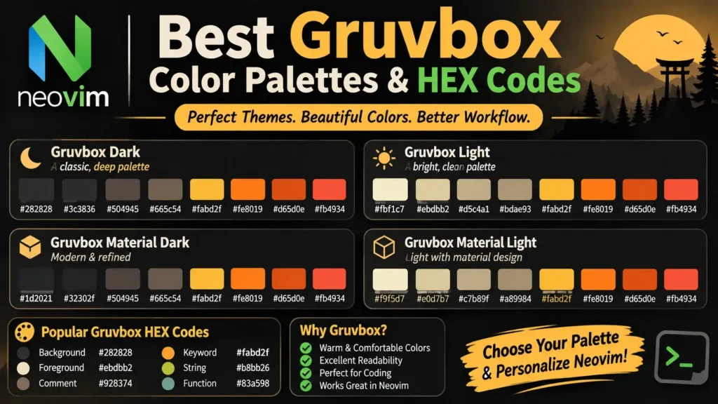
The Gruvbox color palette is one of the most recognizable color schemes among developers and designers. Known for its warm backgrounds, retro-inspired appearance, and distinctive accent colors, Gruvbox provides an attractive alternative to traditional black-and-white themes.
Whether you’re customizing Visual Studio Code, configuring Neovim, designing a website, or creating a terminal theme, Gruvbox offers a versatile collection of colors that can help you create a consistent visual style.
The original Gruvbox color scheme includes dark and light palettes, three background contrast options, and multiple accent color variations.
The standard Gruvbox Dark background is #282828, while the standard Gruvbox Light background is #FBF1C7.
What Is the Gruvbox Color Palette?
Gruvbox is an open-source, retro-inspired color scheme originally created by Pavel Pertsev, also known as morhetz, for the Vim text editor.
The palette combines warm neutral backgrounds with distinctive accent colors, including red, green, yellow, blue, purple, aqua, and orange.
Unlike themes that rely heavily on pure black or pure white backgrounds, Gruvbox uses charcoal, cream, brown, and beige to create a softer, more vintage-inspired appearance.
The color scheme was originally designed for coding environments, but its colors can also be adapted for web design, desktop customization, dashboards, documentation, and other digital interfaces.
Main Features of the Gruvbox Palette
The original Gruvbox design includes several important characteristics:
- Dark and light modes: Two main appearances with coordinated background and foreground colors.
- Three contrast variants: Hard, Medium, and Soft background options.
- Seven accent color families: Red, green, yellow, blue, purple, aqua, and orange.
- Multiple accent intensities: Bright, neutral, and faded colors.
- Warm neutral shades: Charcoal, brown, cream, and beige.
- Customizable HEX codes: Colors that can be reused in CSS, terminal configurations, and editor settings.
- Consistent visual identity: A recognizable retro-inspired design across different applications.
These features make Gruvbox useful for both programming environments and creative design projects.
Gruvbox Dark Color Palette and HEX Codes
Gruvbox Dark is known for its warm charcoal backgrounds and soft cream-colored text.
The standard dark background is #282828, while the commonly used foreground color is #EBDBB2.
This combination creates the classic dark Gruvbox appearance.
Gruvbox Dark Background Colors
| Color Name | HEX Code | Description |
|---|---|---|
| Dark Hard | #1D2021 | Deep charcoal background |
| Dark Medium | #282828 | Standard dark background |
| Dark Soft | #32302F | Slightly lighter dark background |
| Dark 1 | #3C3836 | Dark brown-gray |
| Dark 2 | #504945 | Muted dark brown |
| Dark 3 | #665C54 | Medium brown-gray |
| Dark 4 | #7C6F64 | Warm muted gray |
Gruvbox Dark Foreground Colors
| Color Name | HEX Code |
|---|---|
| Light 0 | #FBF1C7 |
| Light 1 | #EBDBB2 |
| Light 2 | #D5C4A1 |
| Light 3 | #BDAE93 |
| Light 4 | #A89984 |
The lighter shades are commonly used for text, labels, and supporting interface elements.
The exact color assignments may vary depending on the editor or Gruvbox implementation.
Best Uses for Gruvbox Dark
Gruvbox Dark works particularly well for:
- Code editors and terminal applications.
- Developer portfolios.
- Dark-mode websites.
- Programming documentation.
- Dashboard interfaces.
- Retro-inspired digital designs.
The combination of charcoal backgrounds and colorful accents creates a visually distinctive interface without requiring pure-black surfaces.
Gruvbox Light Color Palette and HEX Codes
Gruvbox Light uses cream and beige backgrounds with darker foreground colors.
The standard light background is #FBF1C7, giving the interface a warm, paper-like appearance.
Unlike conventional light themes that rely on bright white backgrounds, Gruvbox Light uses softer neutral tones.
Gruvbox Light Background Colors
| Color Name | HEX Code | Description |
|---|---|---|
| Light Hard | #F9F5D7 | Pale cream |
| Light Medium | #FBF1C7 | Standard warm cream |
| Light Soft | #F2E5BC | Deeper beige |
| Light 1 | #EBDBB2 | Muted cream |
| Light 2 | #D5C4A1 | Sandy beige |
| Light 3 | #BDAE93 | Warm gray-beige |
| Light 4 | #A89984 | Muted tan |
Gruvbox Light Foreground Colors
| Color Name | HEX Code |
|---|---|
| Dark 0 | #282828 |
| Dark 1 | #3C3836 |
| Dark 2 | #504945 |
| Dark 3 | #665C54 |
| Dark 4 | #7C6F64 |
Best Uses for Gruvbox Light
Gruvbox Light is worth exploring for:
- Light-themed code editors.
- Documentation websites.
- Blogs and reading interfaces.
- Minimal developer portfolios.
- Productivity applications.
- Retro-inspired web designs.
Its warm background colors offer an alternative to standard white interfaces.
Complete Gruvbox Accent Colors: Bright, Neutral, and Faded
The original Gruvbox palette includes seven main accent color families.
Each family provides bright, neutral, and faded variations.
These colors are useful for syntax highlighting, interface components, charts, and other visual elements.
| Color | Bright HEX | Neutral HEX | Faded HEX |
|---|---|---|---|
| Red | #FB4934 | #CC241D | #9D0006 |
| Green | #B8BB26 | #98971A | #79740E |
| Yellow | #FABD2F | #D79921 | #B57614 |
| Blue | #83A598 | #458588 | #076678 |
| Purple | #D3869B | #B16286 | #8F3F71 |
| Aqua | #8EC07C | #689D6A | #427B58 |
| Orange | #FE8019 | #D65D0E | #AF3A03 |
Bright Accent Colors
Bright Gruvbox colors are commonly used against dark backgrounds.
For example, Bright Red #FB4934 and Bright Yellow #FABD2F create noticeable visual accents.
Neutral Accent Colors
Neutral colors offer a more subdued appearance.
These shades can be useful for interface components that need color without excessive visual emphasis.
Faded Accent Colors
Faded colors are darker variations of the accent palette.
They can work well against lighter backgrounds, although actual readability depends on the specific color combination.
Gruvbox Dark vs. Light: Color Palette Comparison
The main difference between Gruvbox Dark and Gruvbox Light is the relationship between background and foreground colors.
Gruvbox Dark uses charcoal backgrounds and lighter text, while Gruvbox Light uses cream backgrounds and darker text.
| Feature | Gruvbox Dark | Gruvbox Light |
|---|---|---|
| Main background | #282828 | #FBF1C7 |
| Main foreground | #EBDBB2 | #3C3836 |
| Overall appearance | Warm dark retro | Warm light retro |
| Accent colors | Often brighter | Often darker |
| Contrast options | Hard, Medium, Soft | Hard, Medium, Soft |
| Suitable environments | Dark-interface preferences | Light-interface preferences |
| Web design use | Dark layouts | Light layouts |
| Editor customization | Supported | Supported |
Neither palette is universally better.
The ideal choice depends on your working environment, visual preferences, and readability requirements.
Gruvbox Hard, Medium, and Soft Background Variants
Gruvbox provides three background contrast options for both dark and light modes.
Gruvbox Dark Hard
Dark Hard uses #1D2021, a deep charcoal background.
It is suitable for users who prefer darker interfaces.
Gruvbox Dark Medium
Dark Medium uses #282828, the standard dark background.
It provides the classic Gruvbox Dark appearance.
Gruvbox Dark Soft
Dark Soft uses #32302F, creating a slightly lighter dark interface.
Gruvbox Light Hard
Light Hard uses #F9F5D7, the palest background among the original light variants.
Gruvbox Light Medium
Light Medium uses #FBF1C7, the standard light background.
Gruvbox Light Soft
Light Soft uses #F2E5BC, creating a warmer beige appearance.
Background Variant Comparison
| Variant | Dark HEX | Light HEX |
|---|---|---|
| Hard | #1D2021 | #F9F5D7 |
| Medium | #282828 | #FBF1C7 |
| Soft | #32302F | #F2E5BC |
These options allow users to customize the background without abandoning the overall Gruvbox design.
Best Gruvbox Color Combinations for Coding and Web Design
Choosing a coordinated set of colors helps create a consistent appearance.
Here are several useful Gruvbox-inspired combinations.
1. Classic Gruvbox Dark Palette
Recommended colors:
- Background:
#282828 - Foreground:
#EBDBB2 - Primary accent:
#FABD2F - Secondary accent:
#B8BB26 - Supporting accent:
#83A598
This palette is a practical starting point for dark developer websites, coding dashboards, and terminal-inspired interfaces.
2. Classic Gruvbox Light Palette
Recommended colors:
- Background:
#FBF1C7 - Foreground:
#3C3836 - Primary accent:
#9D0006 - Secondary accent:
#79740E - Supporting accent:
#076678
This combination is suitable for warm, light-themed interfaces.
3. Gruvbox Dark Hard Palette
Recommended colors:
- Background:
#1D2021 - Foreground:
#EBDBB2 - Red:
#FB4934 - Green:
#B8BB26 - Aqua:
#8EC07C
This combination creates a deeper dark appearance.
4. Gruvbox Light Soft Palette
Recommended colors:
- Background:
#F2E5BC - Foreground:
#3C3836 - Red:
#9D0006 - Green:
#79740E - Blue:
#076678
This palette provides a warm, muted light appearance.
How to Use Gruvbox HEX Codes in CSS
Gruvbox colors can be applied to websites and web applications through CSS variables.
CSS variables make it easier to maintain a consistent color system and update your design later.
Gruvbox Dark CSS Variables
:root {
  --gruvbox-bg: #282828;
  --gruvbox-surface: #3c3836;
  --gruvbox-text: #ebdbb2;

  --gruvbox-red: #fb4934;
  --gruvbox-green: #b8bb26;
  --gruvbox-yellow: #fabd2f;
  --gruvbox-blue: #83a598;
  --gruvbox-purple: #d3869b;
  --gruvbox-aqua: #8ec07c;
  --gruvbox-orange: #fe8019;
}

body {
  background-color: var(--gruvbox-bg);
  color: var(--gruvbox-text);
  font-family: Arial, sans-serif;
  line-height: 1.6;
}
This example creates a basic Gruvbox Dark color system.
Gruvbox Light CSS Variables
:root {
  --gruvbox-bg: #fbf1c7;
  --gruvbox-surface: #ebdbb2;
  --gruvbox-text: #3c3836;

  --gruvbox-red: #9d0006;
  --gruvbox-green: #79740e;
  --gruvbox-yellow: #b57614;
  --gruvbox-blue: #076678;
  --gruvbox-purple: #8f3f71;
  --gruvbox-aqua: #427b58;
  --gruvbox-orange: #af3a03;
}

body {
  background-color: var(--gruvbox-bg);
  color: var(--gruvbox-text);
  font-family: Arial, sans-serif;
  line-height: 1.6;
}
This version creates a warm light-mode foundation.
Both examples are starting points rather than complete website design systems.
How to Create a Gruvbox Dark and Light CSS Theme Switcher
If you’re designing a website, you can organize Gruvbox colors into separate dark and light themes.
:root,
[data-theme="dark"] {
  --bg: #282828;
  --text: #ebdbb2;
  --surface: #3c3836;
  --accent: #fabd2f;
}

[data-theme="light"] {
  --bg: #fbf1c7;
  --text: #3c3836;
  --surface: #ebdbb2;
  --accent: #076678;
}

body {
  background: var(--bg);
  color: var(--text);
}

.card {
  background: var(--surface);
}
You can switch between these color systems by changing the data-theme attribute on your website’s root element.
This approach makes it easier to build a consistent dark and light experience.
How to Use Gruvbox HEX Codes in VS Code
Visual Studio Code supports custom editor colors through the settings.json configuration file.
For example, you can apply Gruvbox Dark colors manually:
{
  "workbench.colorCustomizations": {
    "editor.background": "#282828",
    "editor.foreground": "#EBDBB2",
    "editorCursor.foreground": "#FABD2F",
    "editor.selectionBackground": "#504945"
  }
}
This changes several editor colors to match the Gruvbox Dark palette.
You can also customize syntax highlighting:
{
  "editor.tokenColorCustomizations": {
    "comments": "#928374",
    "strings": "#B8BB26",
    "keywords": "#FB4934"
  }
}
For a complete Gruvbox appearance, installing a dedicated Gruvbox VS Code extension is generally more convenient than configuring every color manually.
How to Use Gruvbox Colors in Neovim
Neovim allows users to customize highlight groups through Lua.
For example:
vim.opt.termguicolors = true

vim.api.nvim_set_hl(0, "Normal", {
  fg = "#EBDBB2",
  bg = "#282828",
})

vim.api.nvim_set_hl(0, "Comment", {
  fg = "#928374",
  italic = true,
})
This example applies a classic Gruvbox Dark background and a muted comment color.
If you’re using a Gruvbox plugin, use its built-in configuration options where possible.
Manually applied highlight groups may be replaced when another color scheme loads.
How to Build a Gruvbox Color Palette for a Website
A well-organized color palette should assign each color a specific purpose.
For example:
| Design Element | Suggested Color | HEX Code |
|---|---|---|
| Page background | Dark Medium | #282828 |
| Card background | Dark 1 | #3C3836 |
| Body text | Light 1 | #EBDBB2 |
| Heading accent | Bright Yellow | #FABD2F |
| Success accent | Bright Green | #B8BB26 |
| Informational accent | Bright Blue | #83A598 |
| Warning accent | Bright Orange | #FE8019 |
| Error accent | Bright Red | #FB4934 |
These are design suggestions, not mandatory Gruvbox usage rules.
When assigning colors to status messages, avoid relying on color alone. Include clear labels, icons, or text descriptions.
Gruvbox Color Palette Accessibility and Contrast
A visually attractive palette does not guarantee that every color combination is accessible.
For websites and applications, foreground and background colors should provide sufficient contrast.
The Web Content Accessibility Guidelines (WCAG) recommend:
- A minimum contrast ratio of 4.5:1 for most normal text under Level AA.
- A minimum contrast ratio of 3:1 for large text under Level AA.
- A minimum contrast ratio of 3:1 for certain user interface components and graphical objects.
For example, a color that works well against a dark background may be difficult to read against a light background.
For best results:
- Use high-contrast combinations for body text.
- Test accent colors before using them for small text.
- Avoid conveying important information through color alone.
- Provide visible focus indicators for interactive elements.
- Evaluate your layout in both dark and light modes.
- Use an accessibility contrast checker when selecting final colors.
Gruvbox vs. Gruvbox Material Color Palettes
Gruvbox Material is a separate theme inspired by the original Gruvbox design.
It provides modified color combinations and additional palette choices.
| Feature | Original Gruvbox | Gruvbox Material |
|---|---|---|
| Color style | Classic retro | Modified retro |
| Dark mode | Yes | Yes |
| Light mode | Yes | Yes |
| Accent palette | Original Gruvbox colors | Material, Mix, and Original choices |
| Background options | Hard, Medium, Soft | Hard, Medium, Soft |
| Customization | Yes | Yes |
| Coding use | Yes | Yes |
| Web design adaptation | Possible | Possible |
If you want classic Gruvbox HEX codes, use the original palette.
If you prefer alternative color balances, consider exploring Gruvbox Material.
Common Mistakes When Using Gruvbox HEX Codes
Mixing Dark and Light Accent Colors
Bright accent colors designed for dark backgrounds may not be readable against light backgrounds.
Use the appropriate color intensity for your selected mode.
Using Too Many Accent Colors
Gruvbox contains several colorful accents, but using all of them with equal emphasis can make an interface visually busy.
Choose a limited number of primary accent colors and use the others selectively.
Ignoring Accessibility
Not every Gruvbox combination provides sufficient contrast.
Always evaluate important text and interface components.
Using Different HEX Values Without a Clear System
Inconsistent colors can make a design feel disconnected.
Define a central palette using CSS variables or reusable theme settings.
Assuming Every Gruvbox Port Uses Identical Colors
Some VS Code, Neovim, and terminal implementations modify the original palette.
If exact color matching matters, verify the values used by your selected implementation.
Best Practices for Using Gruvbox Colors
For a consistent and readable design, follow these recommendations:
- Start with the original Gruvbox background and foreground colors.
- Choose one or two primary accent colors.
- Use neutral shades for cards and supporting surfaces.
- Keep text contrast readable.
- Organize colors with CSS variables.
- Test light and dark appearances separately.
- Use consistent colors for interactive elements.
- Pair status colors with descriptive labels.
- Avoid excessive color overrides.
- Verify HEX codes when working with community theme ports.
Frequently Asked Questions About Gruvbox Color Palettes
What is the Gruvbox color palette?
The Gruvbox color palette is a collection of warm neutral backgrounds and colorful accents originally created for the Vim text editor. It includes dark and light modes, background variants, and multiple accent intensities.
What is the Gruvbox Dark HEX code?
The standard Gruvbox Dark background is #282828.
What is the Gruvbox Light HEX code?
The standard Gruvbox Light background is #FBF1C7.
What is the main Gruvbox text color?
A commonly used Gruvbox Dark foreground color is #EBDBB2, while a common light-mode foreground is #3C3836.
What is Gruvbox Red?
Gruvbox Red includes Bright Red #FB4934, Neutral Red #CC241D, and Faded Red #9D0006.
What is Gruvbox Green?
Gruvbox Green includes Bright Green #B8BB26, Neutral Green #98971A, and Faded Green #79740E.
What is Gruvbox Yellow?
Gruvbox Yellow includes Bright Yellow #FABD2F, Neutral Yellow #D79921, and Faded Yellow #B57614.
What is Gruvbox Blue?
Gruvbox Blue includes Bright Blue #83A598, Neutral Blue #458588, and Faded Blue #076678.
What is Gruvbox Orange?
Gruvbox Orange includes Bright Orange #FE8019, Neutral Orange #D65D0E, and Faded Orange #AF3A03.
Does Gruvbox have dark and light palettes?
Yes. Gruvbox supports dark and light modes, each with Hard, Medium, and Soft background variants.
Can I use Gruvbox HEX codes in CSS?
Yes. Gruvbox HEX codes can be used directly in CSS properties or defined as reusable variables.
Can Gruvbox colors be used in VS Code?
Yes. You can install a Gruvbox extension or customize VS Code colors manually through editor settings.
Can I use Gruvbox colors in Neovim?
Yes. Gruvbox themes are available for Neovim, and individual highlight groups can also be customized using HEX values.
Are Gruvbox colors accessible?
Some combinations may meet accessibility contrast standards, while others may not. Test the exact foreground and background colors before using them for important text.
What is the difference between Gruvbox and Gruvbox Material?
Original Gruvbox uses its classic palette, while Gruvbox Material offers modified color treatments and additional foreground palette options.
What is the best Gruvbox palette for websites?
For a dark website, #282828 with #EBDBB2 text is a practical starting point. For a light website, try #FBF1C7 with #3C3836 text. Both should be tested for accessibility.
Final Thoughts
The Gruvbox color palette provides a distinctive collection of warm backgrounds, retro-inspired colors, and versatile accents.
Its Dark and Light modes, Hard, Medium, and Soft background variants, and bright, neutral, and faded accent families offer flexibility for many types of digital projects.
For a classic dark interface, start with Gruvbox Dark #282828 and foreground text #EBDBB2.
For a warm light design, try Gruvbox Light #FBF1C7 with darker text #3C3836.
You can also experiment with colorful accents such as yellow #FABD2F, green #B8BB26, blue #83A598, and orange #FE8019.
Whether you’re customizing a development environment or building a website, Gruvbox offers a consistent visual foundation with plenty of room for personalization.