Choosing the right coding theme can make your development environment more comfortable, visually appealing, and easier to navigate. Among the many available color schemes, Gruvbox Dark and Gruvbox Light stand out for their warm colors, retro-inspired appearance, and distinctive syntax highlighting.
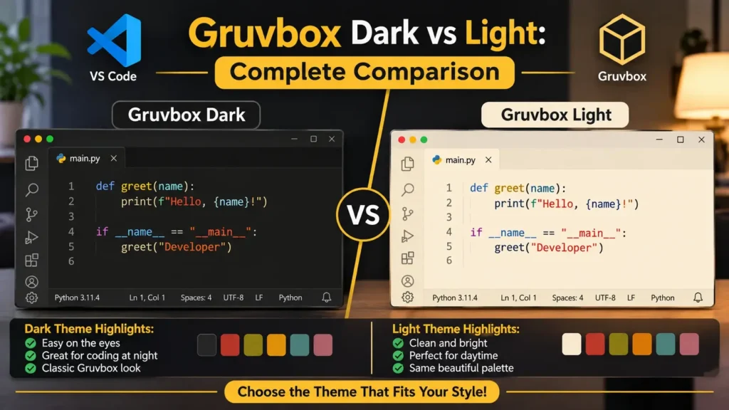
Both themes share the same design philosophy, but they offer different visual experiences. Gruvbox Dark uses deep charcoal backgrounds with lighter text, while Gruvbox Light features warm cream-colored backgrounds with darker text.
If you’re deciding between Gruvbox Dark and Light for Visual Studio Code (VS Code), Vim, Neovim, or another supported editor, understanding their differences can help you make the right choice.
This guide compares their color palettes, contrast options, readability, customization features, advantages, limitations, and practical uses. You’ll also learn how to switch between them and choose the most suitable variant for your coding environment.
What Is the Gruvbox Theme?
Gruvbox is an open-source, retro-inspired color scheme originally developed by Pavel Pertsev, also known as morhetz. It was initially designed for Vim and later adapted for other popular text editors and development tools.
Unlike conventional themes that rely on pure black, white, or highly saturated neon colors, Gruvbox combines warm neutral backgrounds with carefully selected accent colors.
Its recognizable palette includes shades of brown, charcoal, cream, red, green, yellow, blue, orange, purple, and aqua.
The theme provides two primary appearance modes:
- Gruvbox Dark: Uses dark backgrounds and light foreground text.
- Gruvbox Light: Uses light backgrounds and dark foreground text.
Both modes offer three background contrast settings: Hard, Medium, and Soft.
This flexibility allows developers to adjust their editor’s appearance according to their personal preferences and working conditions.
Gruvbox Dark vs. Light: Quick Comparison
The main difference between Gruvbox Dark and Light is their background and foreground color combinations.
Gruvbox Dark creates a subdued interface using charcoal and brown tones. Gruvbox Light uses warmer cream and beige shades to produce a brighter appearance.
| Feature | Gruvbox Dark | Gruvbox Light |
|---|---|---|
| Background | Dark charcoal | Warm cream |
| Foreground text | Light beige | Dark brown-gray |
| Standard background HEX | #282828 | #FBF1C7 |
| Standard foreground HEX | #EBDBB2 | #3C3836 |
| Overall style | Retro dark mode | Retro light mode |
| Accent colors | Brighter shades | Darker, muted shades |
| Contrast options | Hard, Medium, Soft | Hard, Medium, Soft |
| Bright room use | Depends on readability preferences | Often preferred |
| Dim room use | Often preferred | Depends on brightness |
| Syntax highlighting | Yes | Yes |
| VS Code support | Yes | Yes |
| Customization | Yes | Yes |
Quick verdict: Choose Gruvbox Dark if you prefer darker interfaces with bright syntax colors. Choose Gruvbox Light if you prefer cream backgrounds and dark text.
Neither is universally better. Your ideal theme depends on readability, workspace lighting, and personal preference.
Gruvbox Dark Theme: Features, Colors, and Appearance
Gruvbox Dark is one of the most recognizable versions of the Gruvbox color scheme.
It combines deep charcoal backgrounds with warm foreground colors, creating a classic development environment that looks different from modern black-and-blue editor themes.
The standard Gruvbox Dark background is #282828, while its primary foreground color is #EBDBB2.
Together, these colors provide a distinctive warm appearance.
Main Features of Gruvbox Dark
Gruvbox Dark includes several characteristics that make it appealing to developers.
Warm charcoal background
Instead of pure black, the theme uses a charcoal shade with subtle brown undertones.
This gives the editor a softer visual appearance than a completely black interface.
Colorful syntax highlighting
Gruvbox Dark uses bright accent colors to distinguish keywords, strings, functions, and other programming elements.
The exact color assignments depend on the editor and theme implementation.
Three contrast options
Developers can choose between Dark Hard, Dark Medium, and Dark Soft.
Customizable interface
Compatible editors allow users to adjust colors, fonts, cursor appearance, and other interface elements.
Retro-inspired visual identity
The combination of earthy tones and colorful highlights creates a recognizable appearance.
Advantages of Gruvbox Dark
1. A Comfortable Choice for Dark-Theme Users
Developers who already prefer dark interfaces may find Gruvbox Dark appealing because it avoids pure-black backgrounds.
Its warm colors give the editor a distinct visual identity.
2. Reduced Bright Background Area
Dark themes display less bright background area than light themes at equivalent brightness settings.
Some people prefer this appearance in dimly lit environments.
However, comfort varies depending on individual vision and screen settings.
3. Distinctive Syntax Colors
Gruvbox Dark includes contrasting greens, reds, yellows, blues, and other accent colors.
These colors can help developers visually distinguish different code elements.
4. Multiple Contrast Settings
The Hard, Medium, and Soft variants allow users to change the background without switching to a different color scheme.
5. A Consistent Development Environment
With compatible theme implementations, users can apply Gruvbox-inspired colors across editors, terminals, and other development tools.
Disadvantages of Gruvbox Dark
Despite its popularity, Gruvbox Dark may not suit everyone.
Some developers find light text on dark backgrounds harder to read, particularly when using smaller fonts.
Dark backgrounds can also feel less comfortable in very bright environments.
Additionally, certain accent colors may lack sufficient contrast when used for small text.
Best for: Developers who prefer dark interfaces, warm neutral colors, and colorful syntax highlighting.
Gruvbox Light Theme: Features, Colors, and Appearance
Gruvbox Light offers a brighter alternative while maintaining the original theme’s retro-inspired aesthetic.
Instead of charcoal backgrounds, it uses warm cream and beige shades.
The standard Gruvbox Light background is #FBF1C7, while its main foreground color is #3C3836.
These colors create a paper-like appearance that differs from conventional white-background editor themes.
Main Features of Gruvbox Light
Warm cream background
Gruvbox Light uses beige and cream shades rather than pure white.
This gives the editor a warmer appearance.
Dark foreground text
The theme displays text in brown-gray tones that contrast with its lighter backgrounds.
Adjusted syntax colors
The light palette uses darker accent colors to help distinguish different code elements.
Three contrast options
Users can choose between Light Hard, Light Medium, and Light Soft.
Customizable appearance
Compatible editors support additional settings for adjusting fonts, interface colors, and syntax highlighting.
Advantages of Gruvbox Light
1. Familiar Dark-on-Light Reading
Many websites, documents, and printed materials use dark text on light backgrounds.
Developers familiar with this arrangement may prefer Gruvbox Light.
2. Warm Background Colors
The cream-colored background offers a distinctive alternative to bright white interfaces.
3. Suitable for Bright Workspaces
Some users find light editor themes easier to read in environments with strong ambient lighting.
Individual preferences and screen brightness still play important roles.
4. Clear Visual Organization
The theme uses different colors for programming elements, helping users distinguish syntax components.
5. Flexible Background Contrast
Hard, Medium, and Soft options allow users to adjust the background’s overall appearance.
Disadvantages of Gruvbox Light
Gruvbox Light may feel too bright for developers who work in dimly lit environments.
Its beige appearance may also be less appealing to users who prefer cool gray or white backgrounds.
Some accent colors may require adjustments to meet specific accessibility needs.
Best for: Developers who enjoy light interfaces, cream backgrounds, and a classic dark-text-on-light reading experience.
Gruvbox Dark vs. Light: All Six Theme Variants Explained
One of Gruvbox’s defining characteristics is its support for three different background contrast settings in each mode.
These variants allow users to choose the appearance that best matches their preferences.
Gruvbox Dark Hard
Gruvbox Dark Hard uses the background color #1D2021.
This is the darkest background among the original Gruvbox Dark variants.
It creates a deeper charcoal appearance and stronger background separation from light text.
Developers who prefer darker surfaces may enjoy this version.
Gruvbox Dark Medium
Gruvbox Dark Medium uses #282828.
It is the standard background in the original dark palette.
This version provides the classic Gruvbox appearance and is a practical starting point for new users.
Gruvbox Dark Soft
Gruvbox Dark Soft uses #32302F.
Its background is slightly lighter than Dark Medium and Dark Hard.
The result is a more subdued dark interface.
Gruvbox Light Hard
Gruvbox Light Hard uses #F9F5D7.
It has the palest background among the original light variants.
This version offers a brighter cream-colored interface.
Gruvbox Light Medium
Gruvbox Light Medium uses #FBF1C7.
It represents the standard Gruvbox Light background and provides the classic warm cream appearance.
Gruvbox Light Soft
Gruvbox Light Soft uses #F2E5BC.
This shade is slightly deeper than the other light backgrounds, creating a warmer beige appearance.
Six-Variant Comparison Table
| Theme | Background HEX | Appearance |
|---|---|---|
| Dark Hard | #1D2021 | Deep charcoal |
| Dark Medium | #282828 | Standard charcoal |
| Dark Soft | #32302F | Softer dark gray-brown |
| Light Hard | #F9F5D7 | Pale cream |
| Light Medium | #FBF1C7 | Standard warm cream |
| Light Soft | #F2E5BC | Deeper beige |
The contrast names refer primarily to background choices. They do not guarantee compliance with accessibility contrast requirements.
Gruvbox Dark vs. Light Color Palette and HEX Codes
Gruvbox uses a coordinated set of accent colors for both dark and light modes.
The dark palette generally selects brighter accent shades, while the light palette uses darker alternatives.
The following table compares common accent colors from the original Gruvbox palette.
| Color | Gruvbox Dark HEX | Gruvbox Light HEX |
|---|---|---|
| Red | #FB4934 | #9D0006 |
| Green | #B8BB26 | #79740E |
| Yellow | #FABD2F | #B57614 |
| Blue | #83A598 | #076678 |
| Purple | #D3869B | #8F3F71 |
| Aqua | #8EC07C | #427B58 |
| Orange | #FE8019 | #AF3A03 |
These colors can appear in syntax highlighting, interface elements, and terminal customization.
However, individual Gruvbox implementations may apply them differently.
Why Are the Accent Colors Different?
Dark and light backgrounds require different foreground colors to maintain visual separation.
A bright yellow that looks distinct against dark charcoal may be difficult to read against a cream background.
Similarly, a dark blue that works well on light backgrounds may appear less visible against a dark surface.
Gruvbox addresses these differences through separate accent shades.
This helps preserve the theme’s recognizable appearance across both modes.
Which Theme Is Better for Coding: Gruvbox Dark or Light?
Both themes support programming workflows, but neither has an inherent advantage in functionality.
Your choice should depend on your preferences and environment.
For Developers Who Prefer Dark Interfaces
Gruvbox Dark Medium is a strong starting choice.
It provides the classic warm charcoal appearance with colorful syntax highlighting.
If you prefer a deeper background, experiment with Dark Hard.
If you want a slightly lighter surface, try Dark Soft.
For Developers Who Prefer Light Interfaces
Gruvbox Light Medium is worth trying.
It offers a warm cream background and darker text.
Light Hard and Light Soft provide alternatives for users who want a paler or deeper background.
For Beginners
Beginners can start with either Medium variant.
These versions represent the standard backgrounds and provide a useful foundation for comparing the other options.
The most important factor is whether code remains easy to read.
For Long Coding Sessions
Consider your screen brightness, font size, ambient lighting, and readability preferences.
A visually attractive theme is not necessarily the most comfortable for extended use.
Test both modes using your regular coding projects before choosing one.
Is Gruvbox Dark Better for Your Eyes Than Gruvbox Light?
Dark themes are sometimes described as being better for eye comfort, but the relationship between theme color and visual comfort is more complicated.
Gruvbox Dark may feel comfortable to some users because it reduces bright background areas.
Gruvbox Light may be easier for others to read because it uses dark text on a lighter background.
Neither version has been established as a way to prevent eye strain or improve eyesight.
Comfort depends on multiple factors, including:
- Screen brightness
- Room lighting
- Font size
- Text contrast
- Monitor quality
- Glare and reflections
- Individual visual needs
- Breaks during computer use
For accessibility, the Web Content Accessibility Guidelines recommend a minimum contrast ratio of 4.5:1 for most normal text under Level AA.
A color theme can contain combinations that meet this target and others that do not.
Always evaluate important foreground and background combinations individually.
How to Install Gruvbox Dark and Light in VS Code
You can use both Gruvbox Dark and Light through a compatible Visual Studio Code theme extension.
One available extension has the identifier jdinhlife.gruvbox.
Step 1: Open Visual Studio Code
Launch VS Code on your Windows, macOS, or Linux computer.
Step 2: Open Extensions
Click the Extensions icon in the Activity Bar.
Alternatively, use:
- Windows/Linux:
Ctrl + Shift + X - macOS:
Cmd + Shift + X
Step 3: Search for Gruvbox
Enter Gruvbox in the search bar.
Find the extension identified as jdinhlife.gruvbox.
Step 4: Install the Theme
Open the extension details page and select Install.
Allow the installation to finish.
Step 5: Open the Color Theme Picker
Open the Command Palette and search for:
Preferences: Color Theme
Select the command.
Step 6: Choose Dark or Light
Select your preferred Gruvbox variant from the installed themes.
The editor’s appearance will update immediately.
You can repeat this process whenever you want to switch modes.
How to Switch Between Gruvbox Dark and Light in VS Code
Once the extension is installed, changing between themes is simple.
Open the Color Theme picker using:
- Windows/Linux:
Ctrl + K, thenCtrl + T - macOS:
Cmd + K, thenCmd + T
Select Gruvbox Dark or Gruvbox Light.
You don’t need to reinstall the extension.
How to Automatically Switch Between Gruvbox Dark and Light
Visual Studio Code supports automatic theme switching based on compatible operating-system appearance settings.
To configure it, open your user settings.json file and add:
{
  "window.autoDetectColorScheme": true,
  "workbench.preferredDarkColorTheme": "Gruvbox Dark Medium",
  "workbench.preferredLightColorTheme": "Gruvbox Light Medium"
}
Make sure the theme names match the exact labels provided by your installed extension.
When supported by your operating system, VS Code can switch between the selected themes automatically.
This is useful for developers whose computers change between light and dark appearances throughout the day.
How to Customize Gruvbox Colors in VS Code
Visual Studio Code provides several settings for changing the appearance of installed themes.
You can customize the editor background, foreground text, cursor, font, and syntax highlighting.
Customize Gruvbox Dark Colors
For example:
{
  "workbench.colorCustomizations": {
    "[Gruvbox Dark Medium]": {
      "editor.background": "#282828",
      "editor.foreground": "#EBDBB2",
      "editorCursor.foreground": "#FABD2F"
    }
  }
}
This applies classic Gruvbox Dark colors to the selected theme.
Customize Gruvbox Light Colors
{
  "workbench.colorCustomizations": {
    "[Gruvbox Light Medium]": {
      "editor.background": "#FBF1C7",
      "editor.foreground": "#3C3836",
      "editorCursor.foreground": "#AF3A03"
    }
  }
}
This applies warm cream and brown-gray colors to the selected light variant.
Theme-specific settings are useful because they prevent color changes intended for one mode from automatically affecting another.
Change the Font and Text Size
You can also improve the readability of your editor by adjusting font settings.
For example:
{
  "editor.fontFamily": "JetBrains Mono, Consolas, monospace",
  "editor.fontSize": 15,
  "editor.lineHeight": 24
}
Make sure your preferred font is installed.
A readable font and appropriate size can make a greater difference to comfort than changing the color theme alone.
Common Problems With Gruvbox Dark and Light
Gruvbox Is Not Showing in VS Code
If the theme does not appear in your Color Theme picker, verify that the extension is installed and enabled.
Reload VS Code if necessary.
Gruvbox Colors Look Incorrect
Custom settings or other extensions may override the expected colors.
Check workbench.colorCustomizations and editor.tokenColorCustomizations for changes.
Gruvbox Light Looks Too Bright
Try Light Soft, reduce your screen brightness, or adjust the foreground and background colors.
Gruvbox Dark Looks Too Dark
Try Dark Soft or increase your display brightness to a comfortable level.
Some Syntax Colors Are Difficult to Read
Experiment with different variants or customize individual syntax colors.
If readability remains poor, consider another theme that better meets your accessibility needs.
Dark and Light Themes Are Not Switching Automatically
Confirm that automatic color scheme detection is enabled and that your operating system supports the required appearance settings.
Verify that the preferred theme names match those installed in VS Code.
Gruvbox Dark vs. Light vs. Gruvbox Material
Gruvbox Material is a separate theme inspired by the original Gruvbox palette.
It modifies aspects of the color scheme and provides alternative palette options.
While the original Gruvbox focuses on its classic retro palette, Gruvbox Material offers additional variations that some users may find more subdued.
| Feature | Gruvbox Dark | Gruvbox Light | Gruvbox Material |
|---|---|---|---|
| Main appearance | Dark retro | Light retro | Modified retro palette |
| Background | Charcoal | Cream | Depends on configuration |
| Accent colors | Bright | Darker and muted | Adjusted palette options |
| Dark mode | Yes | No, as a specific variant | Yes |
| Light mode | No, as a specific variant | Yes | Yes |
| Customization | Yes | Yes | Yes |
Choose the original Gruvbox if you prefer its classic appearance.
Consider Gruvbox Material if you want to explore alternative color balances within a similar visual style.
Which Gruvbox Theme Should You Choose?
There is no universally best Gruvbox theme.
The following recommendations can help you narrow down your options.
| Your Preference | Recommended Starting Theme |
|---|---|
| Classic dark coding appearance | Gruvbox Dark Medium |
| Deeper dark background | Gruvbox Dark Hard |
| Softer dark background | Gruvbox Dark Soft |
| Classic light coding appearance | Gruvbox Light Medium |
| Pale cream background | Gruvbox Light Hard |
| Warmer beige background | Gruvbox Light Soft |
| Automatic light/dark switching | Configure both Medium variants |
Try your preferred theme with the programming languages and projects you use most often.
Pay particular attention to comments, strings, punctuation, warnings, and selected text.
These elements should remain clearly visible.
Frequently Asked Questions About Gruvbox Dark vs. Light
What is the main difference between Gruvbox Dark and Light?
Gruvbox Dark uses dark charcoal backgrounds and lighter text, while Gruvbox Light uses cream backgrounds with darker text. Both share a warm retro-inspired design.
Is Gruvbox Dark better than Gruvbox Light?
Neither theme is universally better. Gruvbox Dark suits users who prefer darker interfaces, while Gruvbox Light appeals to people who prefer lighter backgrounds.
Which Gruvbox theme is best for VS Code?
Gruvbox Dark Medium and Gruvbox Light Medium are practical starting options. Choose the one that provides the clearest text and most comfortable appearance.
What is the Gruvbox Dark background color?
The standard Gruvbox Dark Medium background is #282828.
What is the Gruvbox Light background color?
The standard Gruvbox Light Medium background is #FBF1C7.
What is Gruvbox Dark Hard?
Gruvbox Dark Hard is a dark variant that uses the deeper background color #1D2021.
What is Gruvbox Dark Soft?
Gruvbox Dark Soft uses #32302F, creating a slightly lighter dark background.
What is Gruvbox Light Hard?
Gruvbox Light Hard uses #F9F5D7, a pale cream background.
What is Gruvbox Light Soft?
Gruvbox Light Soft uses #F2E5BC, a deeper beige background.
Can I switch between Gruvbox Dark and Light?
Yes. Compatible editors such as VS Code allow you to switch between installed Gruvbox variants through their theme settings.
Is Gruvbox free?
The original Gruvbox project is open source and distributed under the MIT/X11 license. Check the licensing terms of individual theme ports.
Is Gruvbox good for Python and JavaScript?
Yes. Gruvbox can be used when editing Python, JavaScript, HTML, CSS, and many other languages. Syntax highlighting depends on language support and the chosen implementation.
Does Gruvbox improve coding performance?
Gruvbox primarily changes your editor’s appearance. It does not directly increase coding speed or improve program execution performance.
Is Gruvbox Dark better for your eyes?
Not necessarily. Some people prefer dark interfaces, while others find light themes easier to read. Comfort depends on lighting, contrast, font size, and individual visual needs.
Can I customize Gruvbox colors?
Yes. Many editors, including VS Code, provide settings for customizing theme colors, fonts, and syntax highlighting.
Final Verdict: Gruvbox Dark or Light?
Gruvbox Dark and Gruvbox Light are both strong choices for developers who appreciate warm colors and retro-inspired editor designs.
Gruvbox Dark offers charcoal backgrounds, cream-colored text, and brighter syntax accents. It is a good starting point for developers who prefer dark interfaces.
Gruvbox Light provides cream backgrounds, darker text, and a warm, paper-like appearance. It is worth exploring if you prefer light coding environments.
Both modes include Hard, Medium, and Soft variants, allowing you to customize the overall appearance without moving away from the Gruvbox design.
For beginners, Gruvbox Dark Medium and Gruvbox Light Medium are practical starting choices.
Experiment with both, adjust your brightness and font settings, and choose the theme that makes your code easiest to read.
Ultimately, the best Gruvbox theme is not necessarily the darkest, lightest, or most popular. It’s the one that creates a comfortable, readable, and enjoyable development environment for you.